

Why ADA Signs?
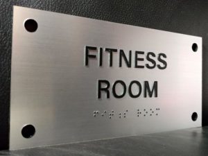
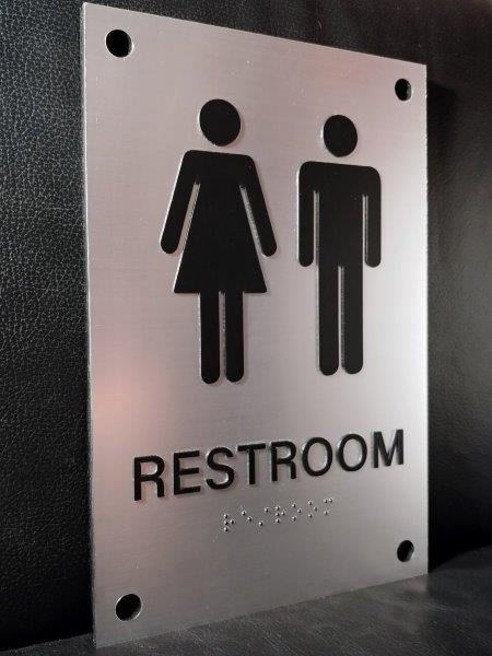
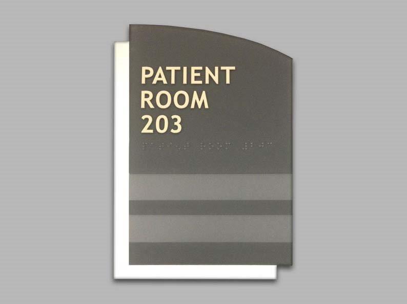
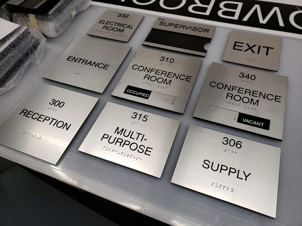
Tactile Rest Room Signage
Text, icons and braille are components of signs that make navigation in an unfamiliar environment easier for everyone.
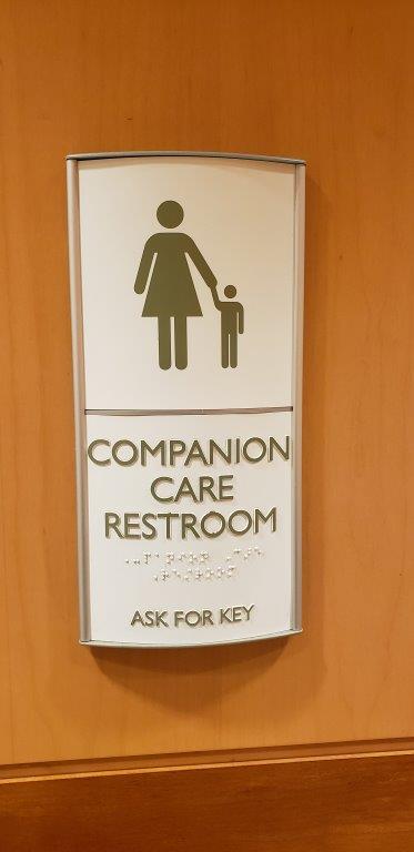
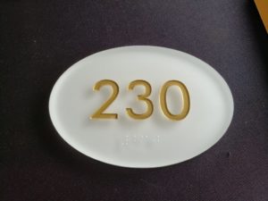
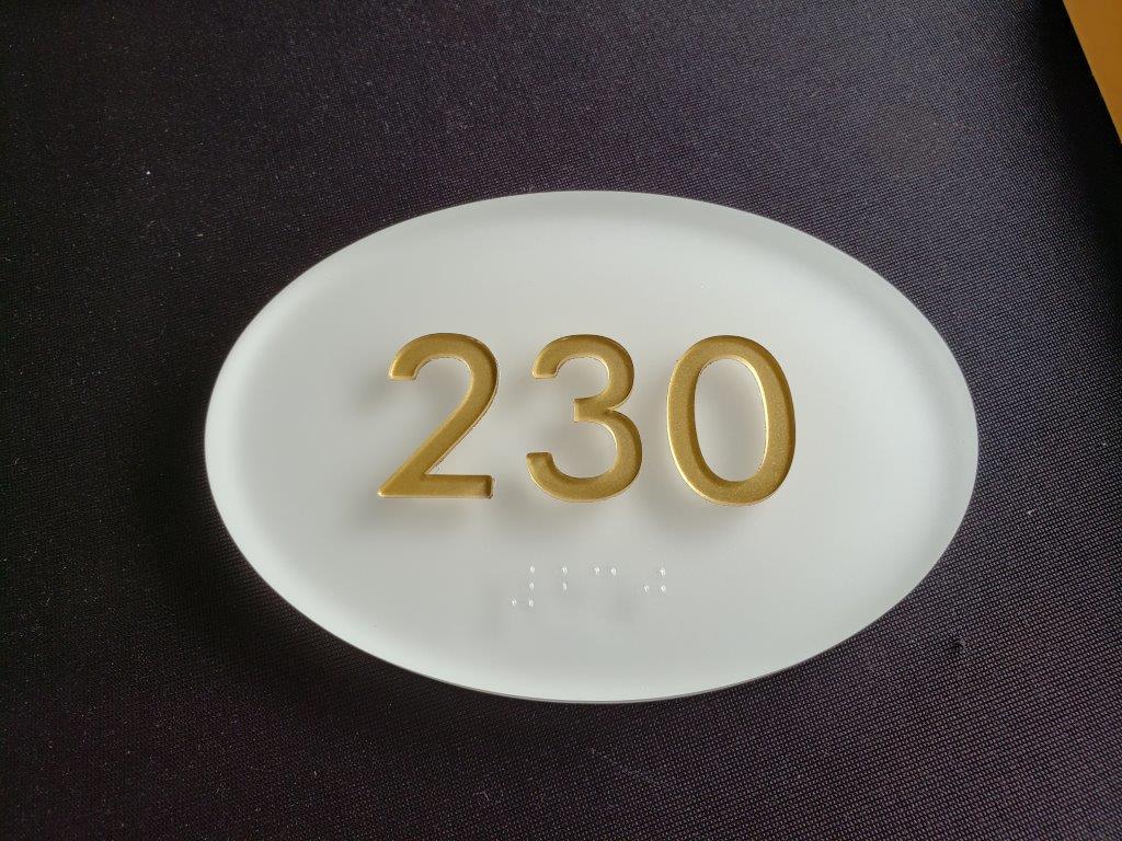
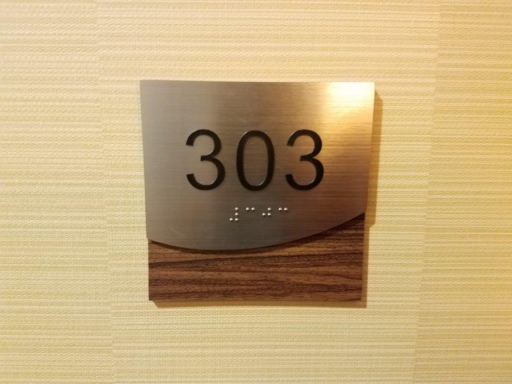
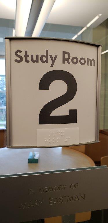
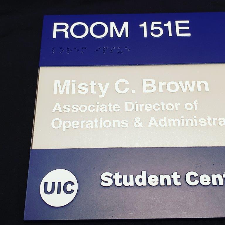
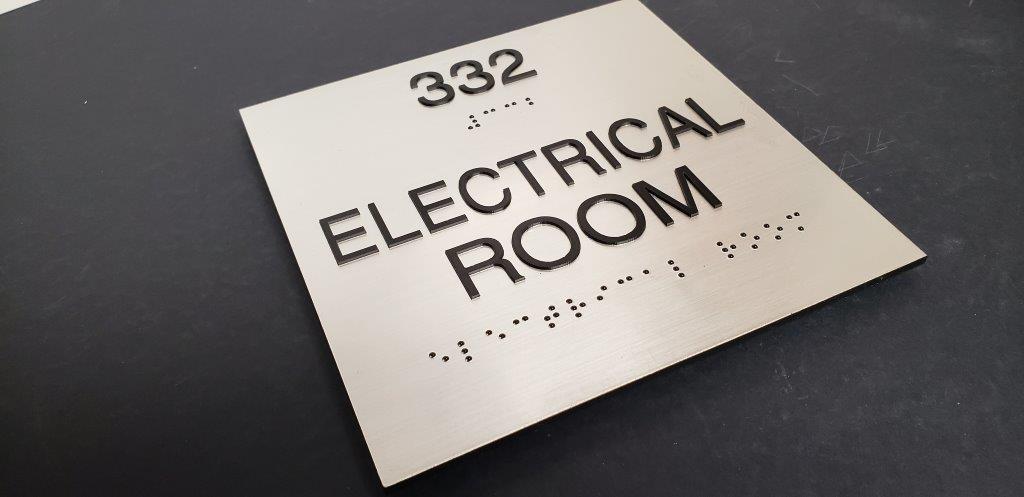
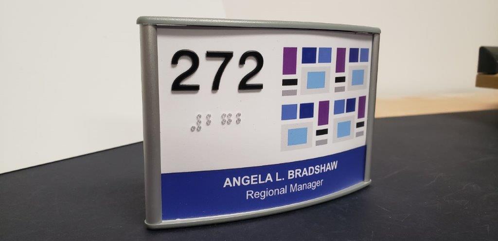
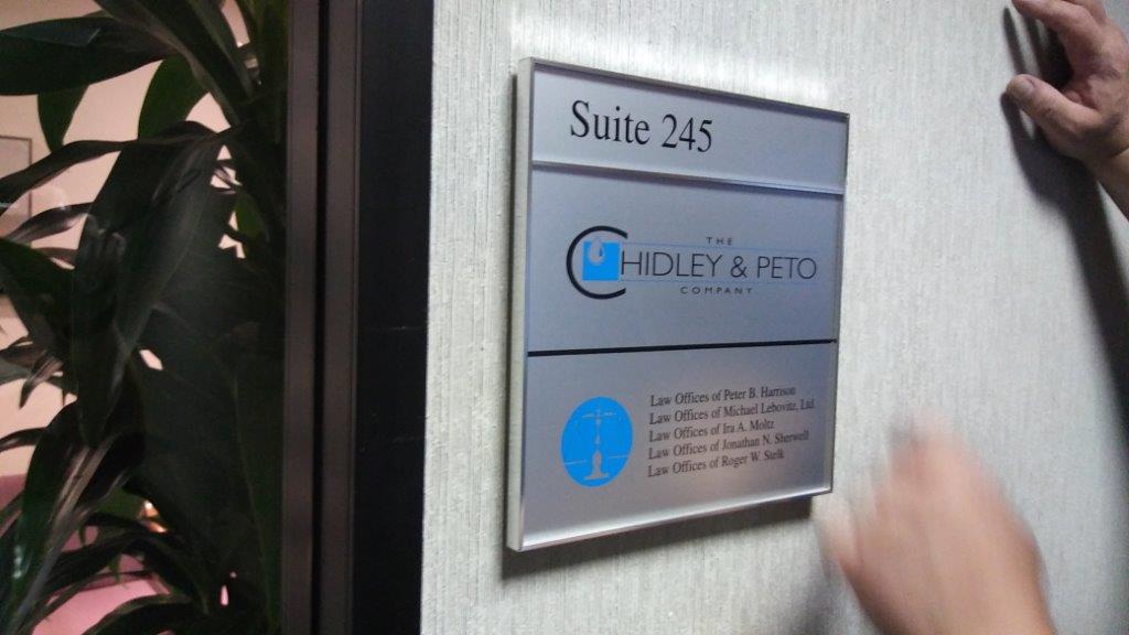
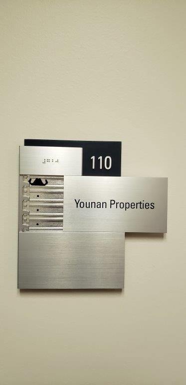
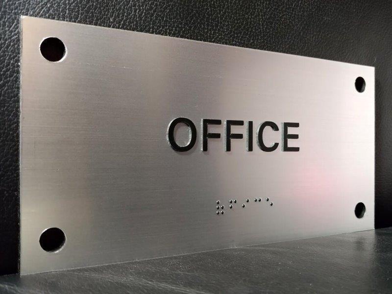
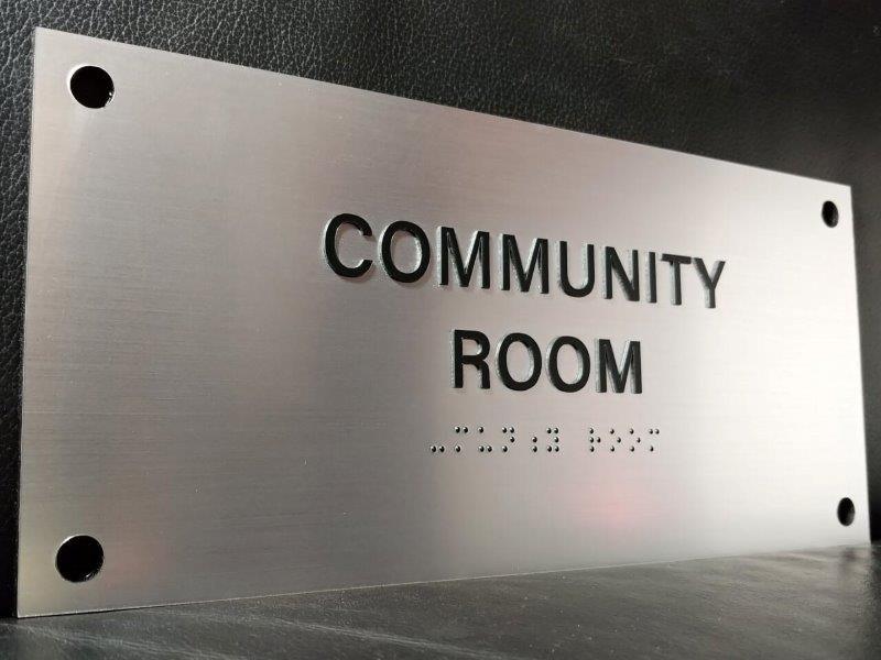
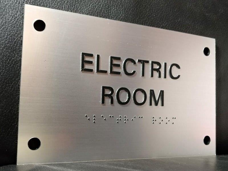
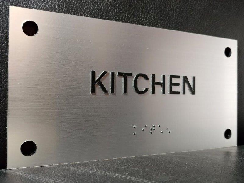
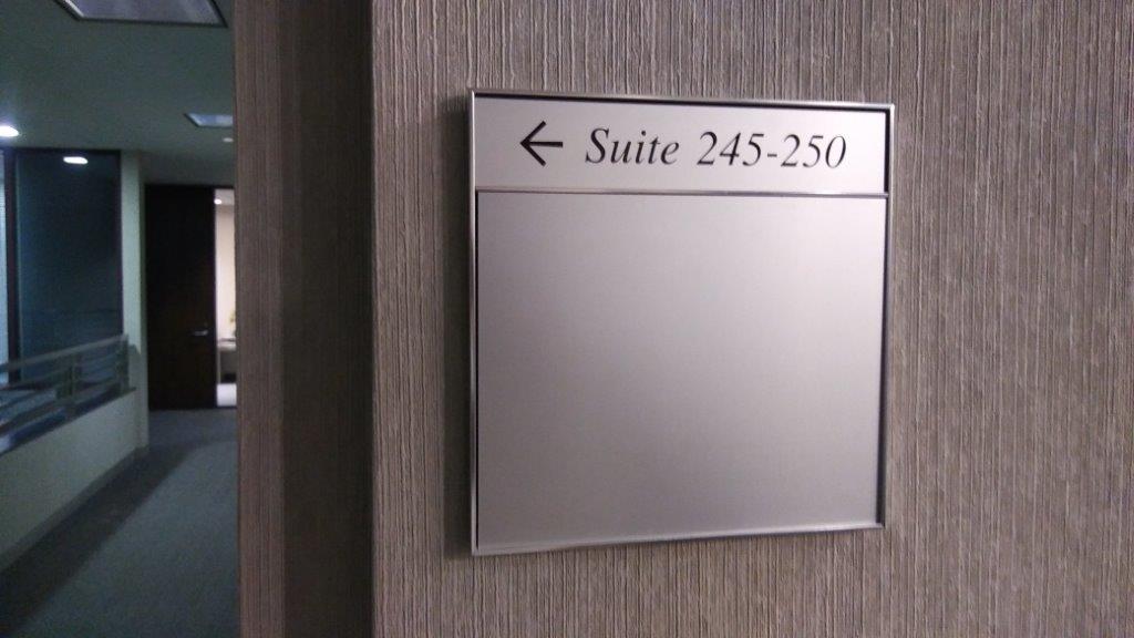
Room & Suite Signage With Braille
Signs with raised letters and numbers make wayfinding easier for all individuals. The uniform design signals an informational landmark in an instant. People quickly learn to look for a certain style of sign for directions. The text and tactile braille information provides navigational cues for a diverse population of clients.


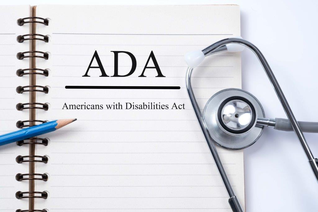
Over 3 million Americans had significant visual impairment in 2015. The National Institutes for Health estimate that this number will double by 2050! The Americans with Disabilities Act was amended in 2010 to include standards for accessible design. The standards specify making signs easier to read for all public buildings.
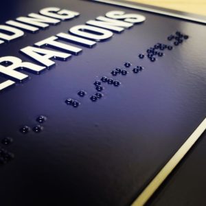
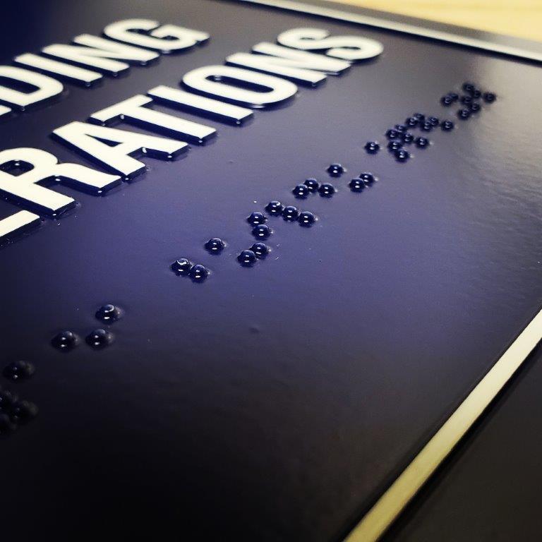
ADA signs include raised type and Braille. The dimensions of the sign, the size of the letters, color contrast and the spacing of the text all must be according to standards to make a sign compliant. Not only does this satisfy the ADA guidelines, it makes the signs easier to read.Sign Artist ensures that each ADA sign is created to satisfy regulatory requirements. We’re educated in the construction of ADA signs and we are operated by a professional occupational therapist. One more advantage that Sign Artist brings to the table.
Guidelines To Make Signs Compliant
Signs must have non-glare backgrounds and characters. Glare and reflection are a major problem for persons with vision impairments, and particularly for the elderly.
Signs must have a high dark to light contrast between characters and their background. The important issue is not color, but lightness and darkness: a sign with white letters on a charcoal gray background would be acceptable, but a sign with red letters on a black background would not.
Signs must have “easy to read” typefaces. This enables persons who are “functionally blind” (have no usable vision) to locate doors and identification of what is in the room.
Strokes are of medium weight, not too bold or too thin. The size of the letters is dictated by the distance of the sign from the expected position of the sign reader. Character size on these signs is to be determined by a chart in the 2010 ADA Standards for Accessible Design that uses a combination of the height of the text above the floor and the distance the reader has to stand from the sign.
ADA signs that identify rooms and spaces are to be located adjacent to the door they identify. One sign is used by both tactile and visual readers, so there are enhancements to assist tactile readers.
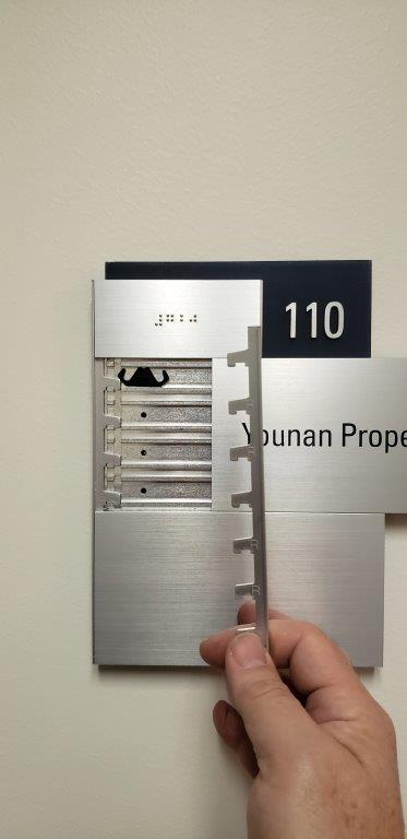
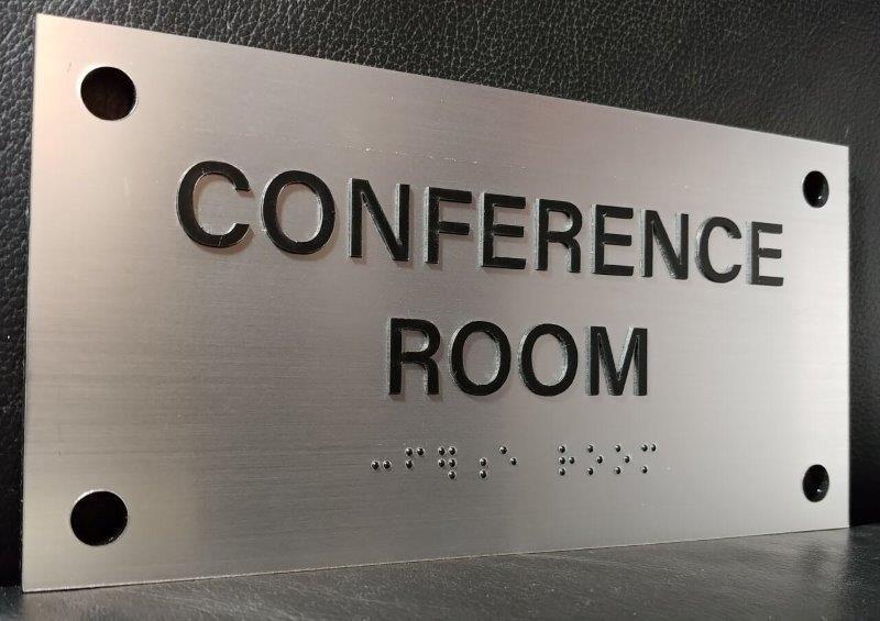
Signs require uppercase characters in sans-serif typefaces with specific requirements related to the stroke and height ratios of the chosen fonts. The characters must be between 5/8 inch and 2 inches high. Braille must be directly below the raised characters and must be Contracted Braille (also called Grade 2 Braille).
Tactile signs must be installed 48 inches minimum from the baseline of the lowest raised character and 60 inches maximum from the baseline of the highest raised character. (Although the definition of “character” doesn’t include Braille cells, the Access Board has stated that the 48 inch rule applies to the base of the lowest line of Braille cells.)
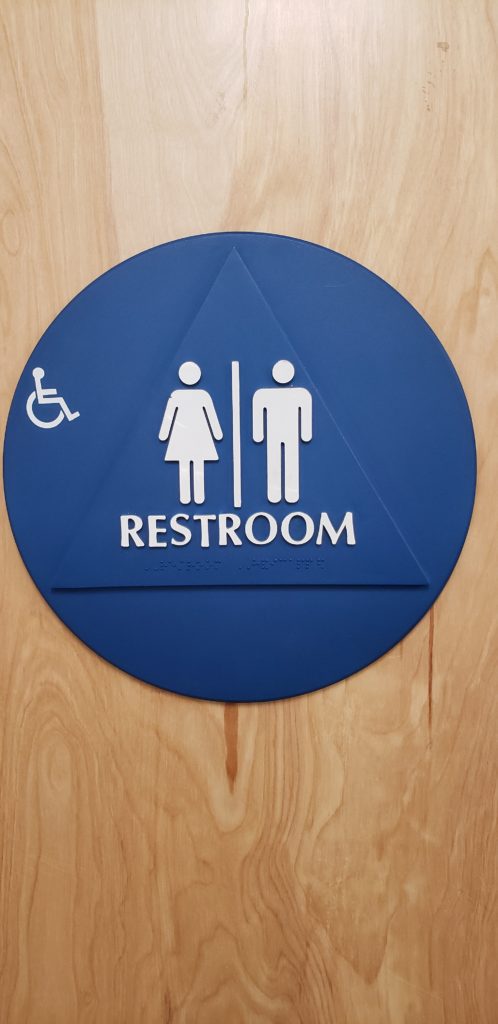
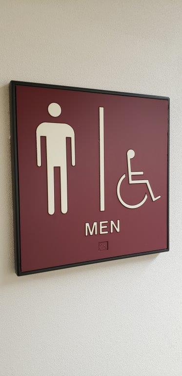
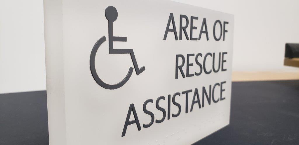
If pictograms are used to identify the space (for example, restroom signs with gender pictograms), they must be in a six-inch vertical field clear of all other content and accompanied by tactile characters corresponding to the pictogram.
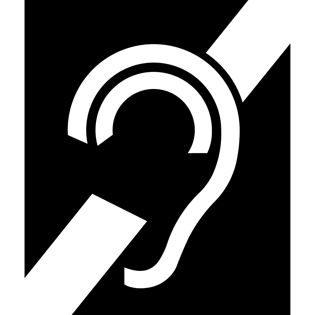
There are four universal symbols of accessibility. One is the familiar International Symbol of Access (ISA), or “wheelchair symbol.” This is used to identify accessible features such as entrances, restrooms, or pathways. Three are specifically for persons with hearing impairments: the “ear” symbol is the International Symbol of Access for Hearing Loss, and is used to show the availability of an assistive listening system. The “keyboard” symbol stands for a TTY or text telephone. The “phone” symbol with sound waves stands for the availability of a volume controlled phone.